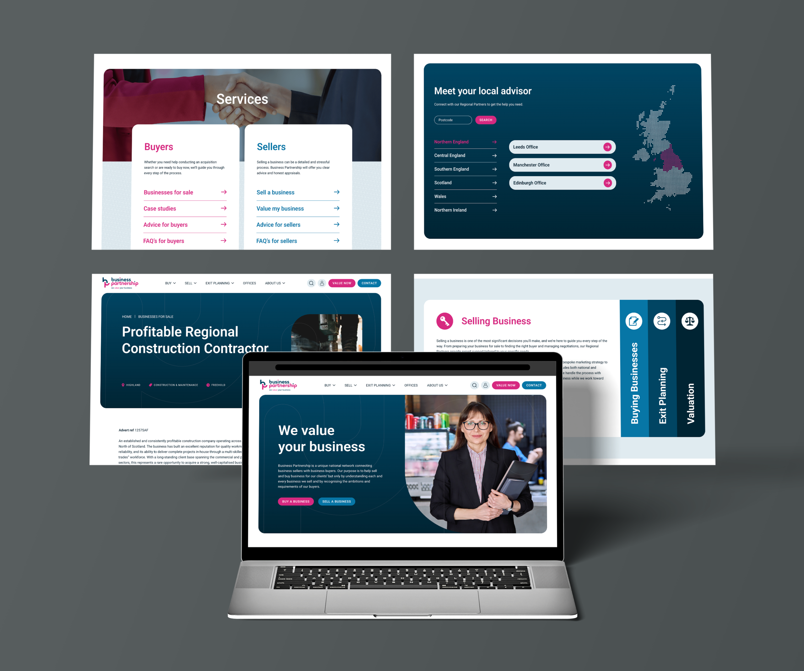
Business Partnership helps people buy and sell businesses across the UK. I worked on redesigning its website, making a large network of business listings, regional offices and partner profiles easier to navigate.
My involvement covered discovery, wireframing and interface design, followed by collaboration with the development team through to launch.
The challenge
The existing website had usability issues, an unclear content hierarchy and content that was difficult to manage.
The redesign needed to bring structure to several connected parts of the business. Visitors had to be able to explore opportunities, understand the services available and find relevant expertise. Behind the scenes, the website needed to accommodate a growing volume of content without becoming harder to maintain.
The central design challenge was making that complexity manageable.
The goal
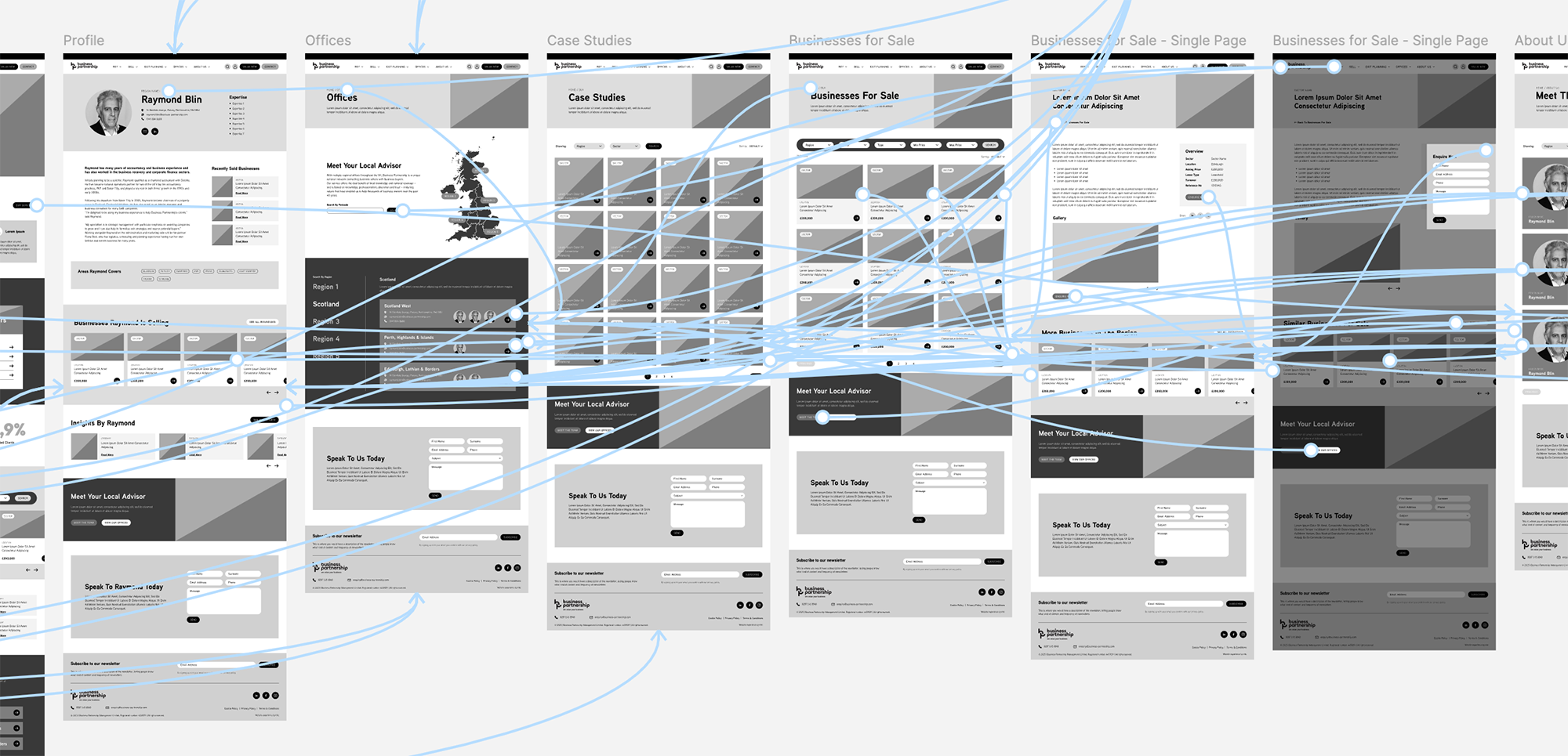
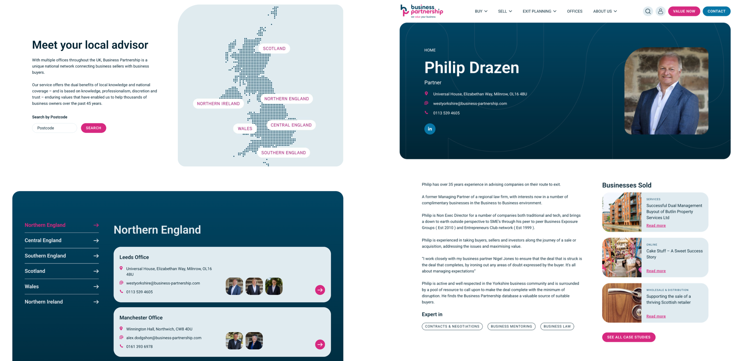
I focused on how the different content types related to one another, including business categories, regional offices and individual partners.
This helped frame the website around the information visitors needed and the routes between it. The aim was to give each page a clear purpose while keeping related content connected, so visitors could move from exploring the business to finding a relevant next step.
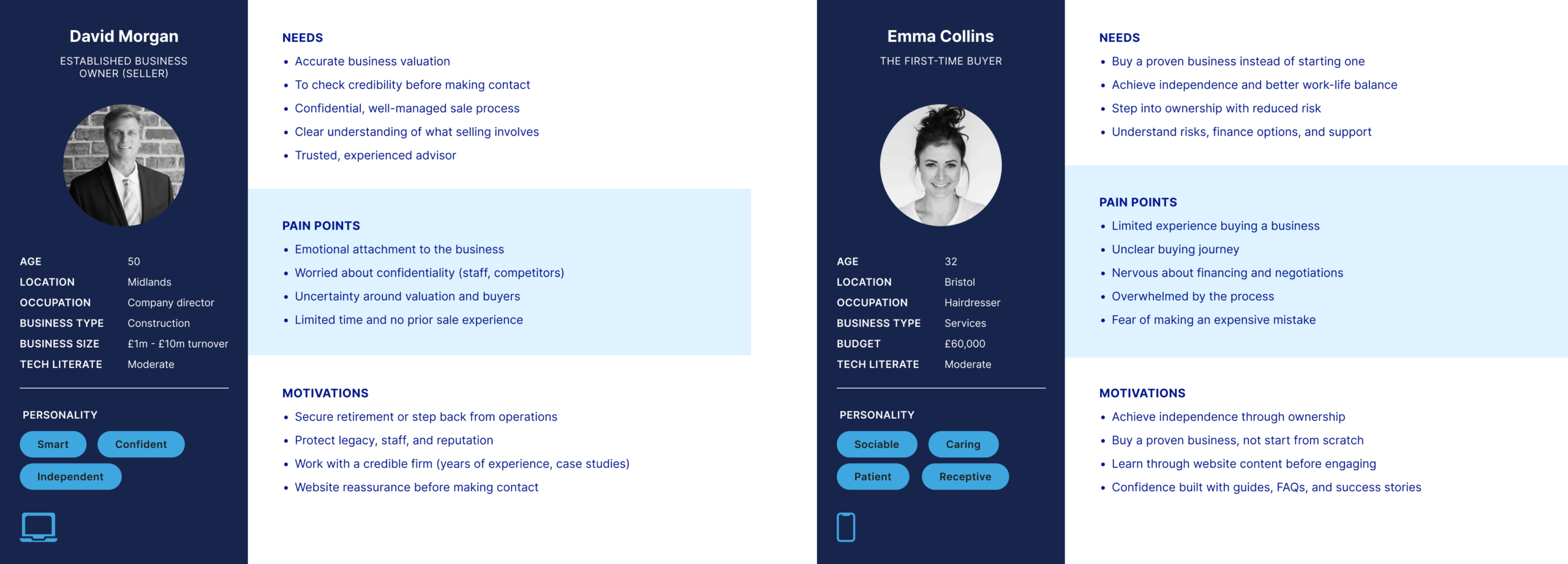
User Personas
Wireframes
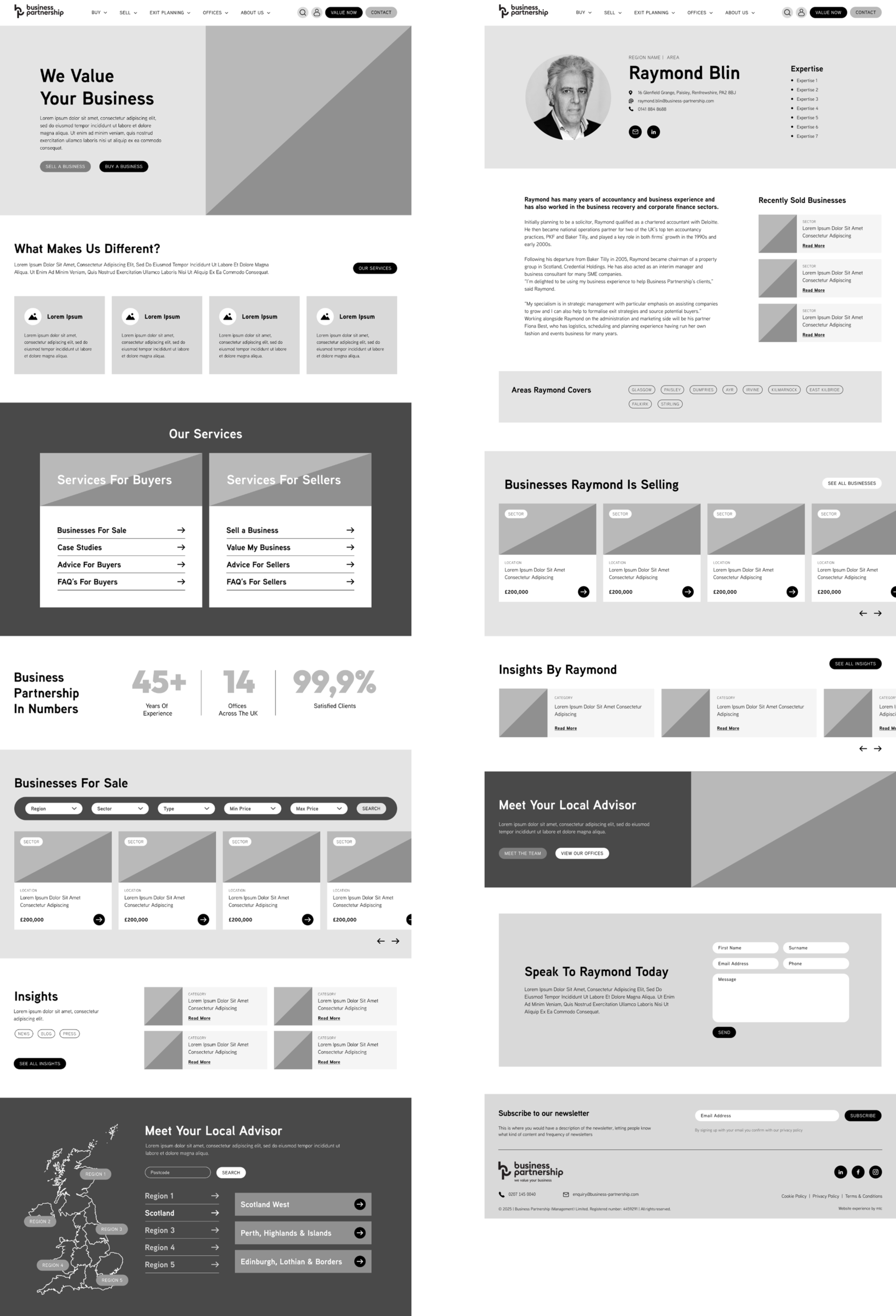
I used wireframes to establish the page structure, content hierarchy and navigation before developing the visual design.
At this stage, the focus was on what needed to appear on each page, which information deserved priority and how users would move through the website. Working at this level made it possible to review the underlying experience before committing to detailed layouts.
The wireframes also provided a shared reference for discussing the proposed structure with the client and development team.
Desktop
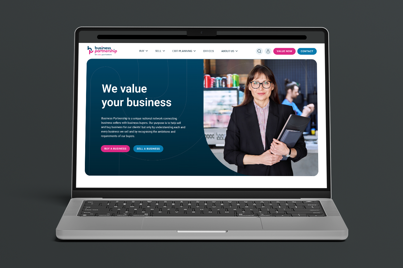
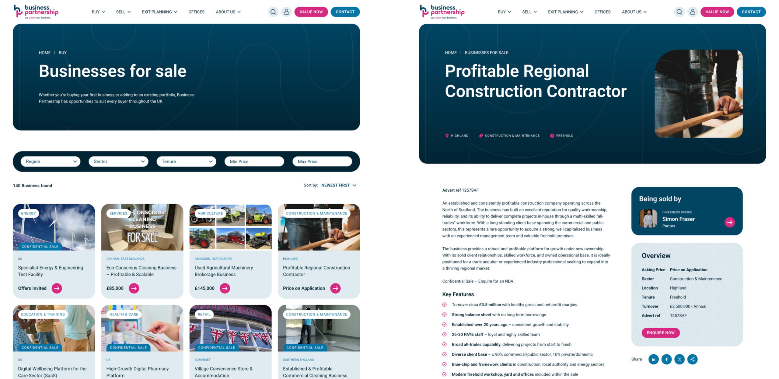
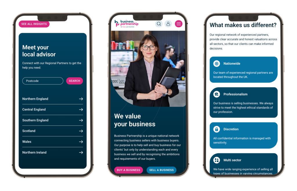
I translated the agreed structure into desktop and mobile designs in Figma.
The interface needed to accommodate detailed content while remaining easy to scan. I focused on clear typography, consistent layouts and a visual hierarchy that helped distinguish supporting information from the actions visitors could take.
Across screen sizes, the goal was to preserve a clear route through the content and make the website feel coherent.
Following the design phase, I worked with the development team through to launch, helping carry the intended layouts and user journeys into the finished website.
The project brought together information architecture, interface design and the practical requirements of managing a substantial content base. My contribution focused on giving that content a clearer structure and creating a consistent experience across the website.